

Table of Contents
- What Is a Minimalist Wardrobe Color Palette?
- How to Choose Wardrobe Colors for Your Skin Tone
- Minimalist Fashion Color Theory in Plain English
- Capsule Wardrobe Color Palette Examples You Can Copy
- Build a Mix-and-Match Wardrobe With Earth Tones
- Budget-Friendly Palette Building and Color Fading
- Conclusion
- Frequently Asked Questions
Last Updated: September 16, 2026
What Is a Minimalist Wardrobe Color Palette?
A minimalist wardrobe color palette is a deliberately limited set of colors chosen so that every piece in your closet works with every other piece. Instead of buying whatever catches your eye, you commit to a defined range of neutral tones and accent colors that multiply your outfit options while shrinking your closet.
Most people own plenty of clothes and still feel like they have nothing to wear. The problem isn't quantity. It's that the pieces don't talk to each other.
The 9-Shade Palette Model
Nine shades is the sweet spot for most closets. Fewer and outfits repeat; more and you lose the mix-and-match benefit that makes a capsule work.
A practical nine-shade breakdown:
- Three base neutrals (for example, black, charcoal, cream)
- Three near-neutrals (camel, olive, stone)
- Three accent colors (burgundy, rust, deep navy)
Base neutrals carry your staples, near-neutrals add depth without breaking harmony, and accents give contrast and personality in small doses.
Neutrals vs. Accent Colors
Neutrals pair with nearly anything: black, white, grey, navy, beige, brown. Accent colors are everything else, and any accent should work with at least two of your neutrals. If it only matches one piece, it's not an accent, it's an orphan.
How to Choose Wardrobe Colors for Your Skin Tone
The fastest way to choose wardrobe colors is to identify your undertone first, then pick a palette that flatters it. Most minimalist guides skip this step, which is why some people build a technically correct capsule that still washes them out.
Warm, Cool, or Neutral Undertones
Undertone is the subtle hue beneath your skin's surface, and it stays constant regardless of how much sun you get.
Quick checks:
- Warm undertones: veins read green, gold jewelry flatters, you tan rather than burn
- Cool undertones: veins read blue or purple, silver flatters, you burn more easily
- Neutral undertones: a mix of both, and most metals work
If your veins look ambiguous or you suit both gold and silver, you're likely neutral.
The Undertone-to-Palette Mapping
Once you know your undertone, the mapping to a minimalist palette is mechanical.
Warm undertones: Anchor on cream, camel, chocolate, and olive. Your black substitute is espresso brown or deep chocolate, which reads as a neutral but carries warmth. Accents that work: rust, terracotta, mustard, warm burgundy. Accents to avoid: icy grey, true silver, cool fuchsia.
Cool undertones: Anchor on true white, light grey, charcoal, and navy. Your cream substitute is a cool off-white or pearl grey. Accents that work: burgundy, plum, emerald, cool berry. Accents to avoid: camel, mustard, warm rust.
Neutral undertones: You can wear most palettes, but consistency matters more than range. Pick either the warm or cool anchor set and stay inside it, mixing both is the fastest way to a closet that feels incoherent even when every piece is technically "neutral."
Why This Beats Guessing
The point isn't to restrict you, it's to stop you buying pieces that technically match your palette but never get worn. A cool-toned person who buys a camel coat because every minimalist guide calls camel a neutral will wear it twice, then leave it in the closet.
People who finally map their undertone stop repeating the same mistake: the camel coat, mustard sweater, and warm beige trousers stop getting bought, and the replacement rate on unworn items drops.
The Seasonal Color Analysis Shortcut
Seasonal color analysis, spring, summer, autumn, winter, is a more detailed version of the same idea. If you know your season, you can skip the undertone checks:
Snow‑Washed St. Louis “The Lou” Graphic →
- Spring and autumn = warm undertones (spring is lighter and brighter, autumn is deeper and muted)
- Summer and winter = cool undertones (summer is lighter and muted, winter is deeper and sharper)
For a minimalist wardrobe, the muted seasons (summer and autumn) map most cleanly onto the low-saturation aesthetic.
Seasonal color analysis overview
Minimalist Fashion Color Theory in Plain English
Color theory for clothing comes down to four levers: harmony, saturation, value, and contrast. Understand those and you can build a palette without memorizing the color wheel, and diagnose why an outfit isn't working.
The Four Levers
Color harmony is colors that share an underlying relationship. Analogous colors sit next to each other on the color wheel and look cohesive; complementary colors sit opposite and create balance through tension. For a minimalist wardrobe, analogous families do most of the work, and complementary pairs are best saved for a single accent.
| Lever | What It Controls | Minimalist Setting |
|---|---|---|
| Harmony | Whether colors belong together | Stick to analogous families |
| Saturation | How vivid each piece reads | Mostly muted, one or two saturated |
| Value | Lightness or darkness of a hue | Keep within a two-step range |
| Contrast | Value difference between pieces | Low to medium, one high-contrast option |
The Value-Step Framework
Assign every piece in your palette a value on a 1-to-5 scale, where 1 is your lightest neutral (cream or white) and 5 is your darkest (black or espresso).
Saturation Drift and Why It Ruins Palettes
Saturation drift is the slow creep of vividness into a muted wardrobe, one purchase at a time: a brighter olive, a warmer rust, a punchier navy. Individually each piece looks fine; together the palette feels loud without any single culprit.
How the Levers Interact
The four levers aren't independent. Raising saturation usually raises perceived contrast even if value stays the same, and lowering value contrast makes a higher-saturation accent feel more acceptable because it has less competition. That's why a single bright accent works in a low-contrast palette but fails in a high-contrast one.
Capsule Wardrobe Color Palette Examples You Can Copy
The easiest way to start is to copy a proven capsule wardrobe color palette example and adapt it. Three structures cover most people.
The 3-3-3 Rule and the 70/30 Split
The 3-3-3 rule means three base neutrals, three near-neutrals, and three accents, wide enough for any occasion, narrow enough that everything mixes. The 70/30 split governs how you wear it: roughly 70% of any outfit comes from neutrals and near-neutrals, 30% from accents. Flip that ratio and the outfit looks busy, defeating the minimalist aesthetic.
Build a Mix-and-Match Wardrobe With Earth Tones
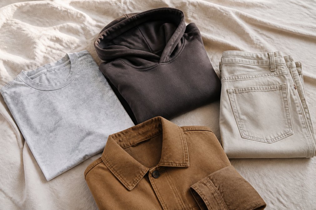
Earth tones are the most forgiving family for a mix-and-match wardrobe because they share warm undertones and sit close in saturation. Camel, olive, rust, clay, and chocolate all read as related, so almost any combination looks deliberate.
Budget-Friendly Palette Building and Color Fading
Building a wardrobe color palette on a budget means buying fewer, better pieces and protecting their color over time. Two things drive cost: how often you replace faded items, and how many pieces you buy that never get worn.
A simple budget framework:
- Set your nine shades before any shopping trip
- Spend the most on base neutrals you'll wear most often
- Buy accents secondhand or on sale, since they get less wear
- Wash like colors together to prevent transfer and uneven fading
Conclusion
The hardest part of a minimalist wardrobe isn't picking colors. It's holding the line when a piece you love doesn't fit the palette you committed to.
Frequently Asked Questions
What is the 3-3-3 rule for a minimalist wardrobe color palette?
The 3-3-3 rule keeps decisions simple: pick 3 neutrals (black, cream, gray or navy), 3 near-neutrals (olive, taupe, brown), and 3 accent colors (rust, faded red, cobalt). Nine shades total, and every piece should match at least two others. It works because it caps choice while leaving room for contrast. Start by counting what you already own in each group before you buy anything new.
How do I choose wardrobe colors that complement my skin tone?
Check your undertone first. Veins that read green suggest warm undertones, blue or purple suggest cool, and a mix means neutral. Then match saturation: warm undertones sit well with earthy tones like olive, camel, and rust, while cool undertones suit charcoal, slate, and icy blue. Hold fabric near your face in daylight before committing. If your skin looks gray or washed out, drop that shade from your palette.
Can a minimalist wardrobe color palette include bold statement colors?
Yes. Minimalism limits quantity, not personality. The 70/30 rule handles this: 70 percent of your wardrobe in neutral tones and 30 percent in accent colors, including one loud statement shade. A faded red or cobalt graphic tee can anchor a mostly black-and-cream rotation. Just make sure the bold piece matches at least two neutrals you already own so it earns its space.
How do I keep a wardrobe color palette from fading over time?
Wash inside out in cold water on a gentle cycle with mild detergent, and skip bleach, soak, and wring. Wash like colors together, hang dry away from direct sunlight, and iron or tumble dry at low temperature (max 30°C or 90°F). Snow-washed and sun-faded pieces are designed to fade, so a slight change in tone is expected. Reactive-dyed pieces hold color longer with the same routine.